Bob Rubis @hrbrmstr recently has blogged several interesting posts [ 1, 2] about making dumbbell plots with ggplot2 via his package ggalt. @Tylerrinker did some really nice work reproducing a Pew dumbbell plot back in early 2015, which I found really helpful.
Seeing @hrbrmstr’s posts reminded me of a project I did about 8 months ago. I was mocking up a way to compare two entities on a set of factors. The mock-up ended up as what I now know is called a dumbbell plot. Seeing these several posts, I realized that they all had something in common which my mock-up didn’t share. Unlike the earlier examples of a dumbbell plot, in the context I was working, entities being compared could switch their relative rank on the x-axis.
Also, in addition to rank order changing, I wanted to highlight that some gaps, independent of their lengths, were more substantive/important than others. Both were fun challenges to incorporate into the dumbbell and something I hadn’t seen encoded in the other dumbbell plots.
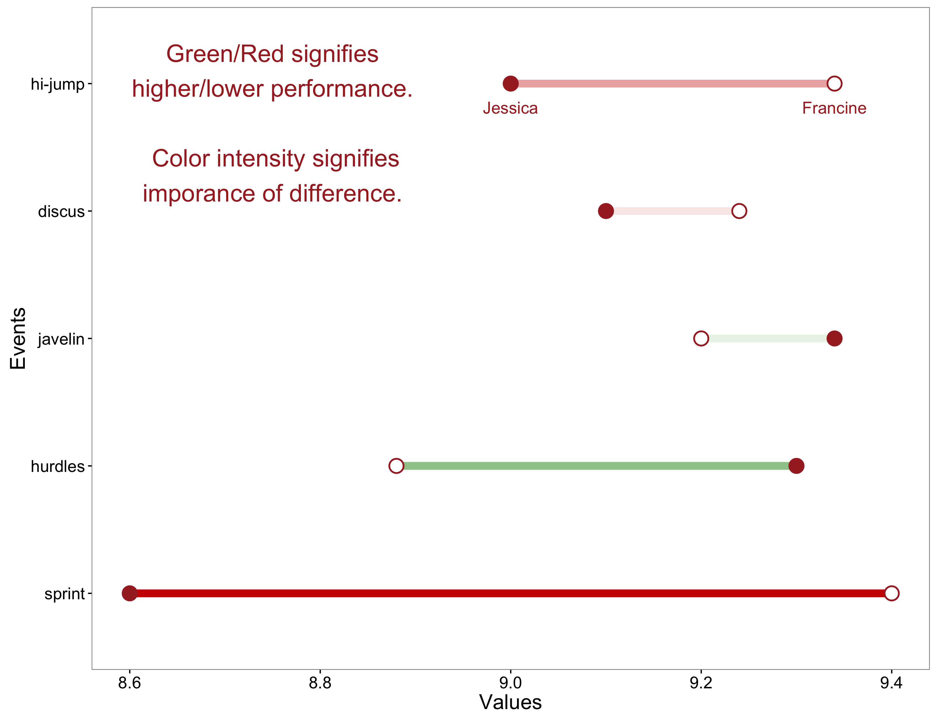
To make things concrete, let’s use a working example. Say, there’s a coach who wants to know how her athlete Jessica compares along judges scores to her strongest competitor Francine on 5 track-n-field events. Because she’s savvy, the coach decides to graph these difference on one dumbbell graph. The coach really wants to make clear to Jessica which events Jessica’s stronger and weaker than her competitor Francine.
pacman::p_load(dplyr, tidyr, ggplot2)
dat <-data.frame("Jessica" = c(8.6, 9.3, 9.34, 9.1, 9),
                 "Francine" = c(9.4, 8.88, 9.2, 9.24, 9.34),
                 "Events" = factor(1:5,labels=c("sprint", "hurdles","javelin", "discus", "hi-jump")))
To make the information apparent, I encode relative rank and gap size in the graph using color and alpha levels, which are the main additions to previous dumbbell plots. The relative order (win/loss) within each sporting event is encoded by the colors green/red. The intensity with which the entity of interest (Jessica in our example) wins or loses is captured with the alpha level intensifying for greater gaps and lessening for smaller ones.
This use of alpha level is especially useful in cases were the statistic being compared may have some dispersion around it, such that faint alphas suggest the difference isn’t meaningful. And I like alpha here. I had tried varying the line width to encode intensity at first; though it did attract my eyes’ attention more to the more intense differences, I didn’t like how it ruined the symmetry in the visual aesthetic.
So here’s my version of a dumbbell function to create the graph above.
ggdumbbell <- function(d ,colors=c("green4","red3","brown") ,sz=17){
    nms <- names(d);names(d) <- c("xvar","yvar", "fvar")
    df <- d %>% dplyr::mutate(
                   abs_diff = abs(xvar-yvar),
                   pos_neg = sign(xvar-yvar),
                   midpoint = abs_diff/2,
                   clr = ifelse(pos_neg>0, colors[1], colors[2]) ) %>%
                 rowwise() %>%
                 mutate(xmin = min(xvar,yvar), xmax = max(xvar,yvar)) %>% ungroup

    df_tall <- df %>%
        tidyr::gather(keys, values, -c(fvar, xmin, xmax, midpoint, pos_neg, abs_diff, clr)) %>%
        mutate(keys=ifelse(keys=="xvar", nms[1], nms[2]))

    l <-  as.character(df[["fvar"]][as.integer(df[["fvar"]])==max(as.integer(df[["fvar"]]))])
    ll <- if(d[1,1]<d[1,2]) nms[1:2] else nms[2:1]

    ggplot(df_tall, aes(y=fvar, x=values) ) +
        geom_segment(data=df, aes(x=xmin, xend=xmax, y=fvar, yend=fvar, alpha=abs_diff)
                            , color=df$clr, size=3) +
        geom_point(color = colors[3], size=5.5)  +
        geom_point(shape=21, color = colors[3], size=4.8, aes(fill=keys))  +
        scale_fill_manual(values = c("white", colors[3]), guide=FALSE) +
        theme_bw()  + theme(text=element_text(size=sz),legend.position="none", panel.grid = element_blank() )  +
        annotate("text"
           , x = c(df[df$"fvar"==l,]$xmin,df[df$"fvar"==l,]$xmax)
           , y= c(df[df$"fvar"==l,]$fvar,df[df$"fvar"==l,]$fvar)
           , label=ll , color = colors[3], size=4.8 , vjust = 2.5) +
        labs(list(x="Values",y=nms[3])) +
        annotate("text", x=8.75, y=5
                 , label="Green/Red signifies\nhigher/lower performance.\n\n Color intensity signifies\nmagnitude of difference."
                 , color=colors[3], size=7, vjust = .75)
}

ggdumbbell(dat) +
  ggtitle("Francine's performance against Jessica")
I’ll not pretend to have it packaged up as nicely as @hrbrmstr has in ggalt. He’s managed to set up his data and/or his function such that he doesn’t appear to need to have a wide and tall set of dataframes.
For me, a rather frustrating point about geom_segment() is how its aes handles the color arguments. It took me 2 hours of googling and fiddling to figure out that if you want the segments to vary by color where you actually define the colors, you need to have the color arg assigned outside the aes.
p <- ggplot(data=something)

p + geom_segment( aes(x=a, xend=b, y=A) , color=color_vec)   # you control colors

p + geom_segment( aes(x=a, xend=b, y=A, color=color_vec) )   # color does sth else
Check out Hadley’s use of the color arg inside of aes at his ggplot documentation page to find another way to use color to distinguish between curves and segments. It’s the first example.
