Over the past couple months there have been datavizs showing global average temp trends. They have gotten a lot of media attention, so I got to see examples fairly regularly. Several of them (e.g., 1 and 2) used the same HadCRUT global temperature anamolies data, analyzing it with different techniques or technologies to highlight specific statistics, namely the mean. I liked @ucfagls’s simulation work on the averaged data and @hrbrmstr’s incorporation of the error model’s confidence intervals over time.
Most of these posts above emphasize the temporal nature of the data, as it is often the processed averaged values that they are using for data; these averages aggretate what observations are present over the globe at each time interval. After staring at these a while, I began to wonder at the decades-long downturns in the global averages that begin around the 1900s and again 1940s. These downturns left me stumped to reconcile what I knew generally of industrial economic development practices going on around the world at those times.
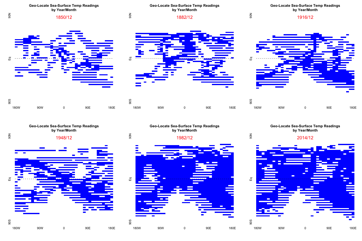
I decided to take a peak at the rawest data I could easily access from public records. Some fun data-play ensued. From that, I’ll be sharing a series of posts emphasing the geo-spatial nature of the temperature records as the collection patterns evolved over time.
The gif above is the output of the first steps I took to process the raw HadCRUT data.
HadCRUT4 data
In order to get the rawest data possible for the HadCRUT4 you have to go here to get the components datasets it’s synthesized from. The HadSST3 are the sea-surface data and CRUTEM4 are the land-surface data.
In this post I’ll work with the sea-surface data, HadSST3. Other posts I’ll work with land-surface and compiled data, as well.
Three steps will be needed to complete the animated gif above:
- get the text data and split it up by its time intervals
- parse and clean the data
- create a fun gif showing recordkeeping over time
Get and split up
pacman::p_load(tidyverse, curl)
temp <- tempfile()
curl_download("http://hadobs.metoffice.com/hadsst3/data/HadSST.3.1.1.0/ascii/HadSST.3.1.1.0.unadjusted.zip",temp)
data <- readLines(unz(temp, "HadSST.3.1.1.0.unadjusted.txt"))
unlink(temp)

data[1:2]
[1] "       1    1850 36 Rows 72 Columns.  Missing =  -99.99 Version = HadSST.3.1.1.0       Field_status = f Realisation = -1"
[2] " -99.99  -99.99  -99.99  -99.99  -99.99  -99.99  -99.99  -99.99  -99.99  -99.99  -99.99  -99.99  -99.99
The pattern in the data is first line has all the meta data like month and year the data represents and then the next 36 contain the contents of the 36x72 numeric matrix of gridded temperature readings. So I use that pattern to create a regex to define the beginning of new year’s worth of data. And then just split the matrices up into a list of matrices.
# meta-data pattern defining when each new matrix begin
ii <- grepl("\\d+\\s+\\d{4}\\s+\\d+\\s+Rows", data)
sum(ii)/12+1850  # should add up to 2016+

counter <- 0
index <- rep(NA,length(ii))

for (j in 1:length(data)){
  if(ii[j]){
    counter=counter+1
    index[j]=counter
  } else {
    index[j] = counter
  }
}

dat_list <- split(data,index)
length(dat_list)

all(sapply(dat_list,length)==37) # correctly parsed
Parse and Clean
The main objective of this loop is to extract the year-month data from the meta data and to define the matrix. The matrices are very sparse, especially before 1900; so a simple ifelse will suffice to get at gridded locations of a measurement. Again the point is the locations, not whatever values are actually present in the data. (Feel free to use whatever parallelization tool you prefer here.)
Since this is monthly data over many years, I mainly want to give an overall progression over 150+ years. So I’ll be plotting the matrix for every 24 months, starting with the first Dec in the data, from 1850. I intend to use all the data in the next post; so we’ll have a chance to see all the data, but I didn’t want the gif to be too big.
yrmn_step <- seq(12,2000,by=24) # every other year
yrmn_step
dat_mat <- lapply(dat_list[yrmn_step], function(x) {

  # first line has meta data
  meta <- x[1]
  yr <- regmatches(meta,regexec("\\d{4}",meta))[[1]]
  mo <- regmatches(meta,regexec("\\d{1,2}",meta))[[1]][1]
  mo <- ifelse(as.integer(mo)<10,paste0("0",mo),mo)

  # remaining 36 have data
  mx <- x[2:37]
  mx <- sapply(mx, function(y) {
    m <- as.numeric(strsplit(trimws(y),"\\s+")[[1]])
    ifelse(m==-99.99, 0,1)  # replace missing with 0, non-missing with 1
  })

  m <- matrix(mx,36,72)
  colnames(m) <-  c(paste0(seq(175,5,by=-5),"W"),0,paste0(seq(5,180, by=5),"E"))
  rownames(m) <- c(paste0(seq(85,5,by=-5),"S"),"Eq",paste0(seq(5,90, by=5),"N"))

  ym <- paste0(yr,"/",mo)
  list(ym,m)
})
Animate gif
I would recommend sending the output of this task to its own folder to help with the animation step later.
plots <- file.path(getwd(),"plots/had_plots/")
Since the data is one big numerical matrix, plotting in base R using image seemed the fastest and most similar to other graphs you see on the government websites. I’ve included a horizonal dashed line to keep the Equator evident.
# plot every other Dec snapshots
lapply(dat_mat, function(x){
  png(paste0(plots,substr(x[1],1,4),".png"))
  image(x[2][[1]], col=c("white", "blue"), axes=FALSE
    , main="Geo-Locate Sea-Surface Temp Readings\nby Year/Month")
  abline(h=.5, lty="dashed")
  text(y=.98,x=.5,labels=x[1], col="red", cex=1.5)
  axis(1, at = c(0,0.25, 0.5, 0.75, 1),
       labels=c("180W", "90W", "0", "90E", "180E"),
       srt=45,tick=FALSE)
  axis(2, at = c(0,0.5,1),
       labels=c("90S", "Eq", "90N")
       ,srt=45,tick=FALSE)
  dev.off()
})
Now to apply the animation. I suppose you could use the animation package, but I just used the command line tools. I’ll show you how. First change directories to where your new pngs are. You can download ffmpeg from here for whatever platform. I found the system tool could successfully call the ffmpeg function convert and get it to work. (On my Mac OS, system2 could handle the pwd call, but not convert.)
# install ffmpeg from https://ffmpeg.org/download.html
setwd(plots)
system("pwd")
system("convert -loop 1850 *.png animated.gif")
The animated.gif file should be in the same folder.
In the next post, I’ll return to the monthly data. Using all the data this time, I’ll do some summarizations and plotting of the geo-spatial variation over time.
